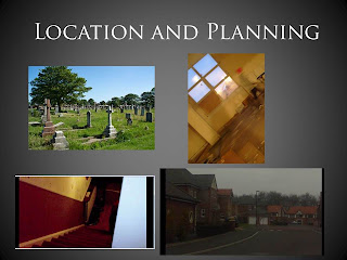
When we were researching our ancillary texts again we had a rough idea of how magazine cover and posters look, but in hindsight, we didn’t really know that much about the horror genre when it came to how the magazine looks. This is why we did more research into it and the evidence is on my blog. We also used photoshop which I had little experience in using and I think I developed my skills in using it quite quickly, and ended up producing something that was decent and which linked to the main trailer product. I also used the internet for some guidance on how to create some of the effects in photoshop. I also used the internet to compare the products I had made to some original ones, I think the poster that we created replicates some of the colour schemes used in the official posters, and also we received audience feedback saying that the poster looked good and looked similar to other posters they had seen which is also a good sign. I think the picture looks good small and centered in the middle of the page and think it looks like the poster used for last house on the left.
Friday, 30 March 2012
Evaluation: Question 1 , how does your Media Product develop, conform to and challenge conventions of real media products?
Our trailer conforms to other horror trailers that we have researched as we have included quite a classic plot using the idea of a child being possessed and then he turns against his family and ends up committing a lot of crimes and murders to his family. As well as this we conformed to the stereotypical sets that clearly display the genre to the audience such as the dark forest and a haunted house that are used in a number of films that were researched such as the last house on the left and we found that they were also very common in the films that were aimed at the lower age range 12- 15 which is the audience that we wanted to target. The characters that we used are quite similar to the normal type of characters that are in a horror film we have an innocent character of the boy at the start before he changes and the villain which is the evil ghost that possesses him. But our trailer challenges this slightly as the boy is seen as innocent and as the villain as he changes persona throughout the film. The trailer. Our trailer also conforms to that of a real trailer because of the pace of it, we tried to make it so that the start of the trailer appears much more brighter in contrast to the end where the trailer gains speed and the imagery becomes much darker and intense this is often the case with other trailers that have been researched but there are a few which go straight into the gore and the quick pace of it this is normally in trailers for films that are classified as being an 18 certificate.

 In the early stages of planning and thinking of what we were going to do for our product we had decided on producing a horror trailer. But we did not completely know all the codes and conventions within this genre and this is what we learnt, by the use of the internet we gained in knowledge of some of the components that make up a horror trailer, for example we probably didn’t realise that we could have a frightening image after the main title at the end of the trailer. We knew the rough structure of this type of trailer but we needed to know the type of footage that we needed to include and also the speed and music that could accompany the trailer. By researching various different types of trailers all of the horror genre we learnt that we needed to have a contrast between the start and the climax of the video. This how the happy bright start with the normal family at the start of the film came about which contrasted with the much darker ending. Also we learnt towards the end of our project that the trailer needed to gain speed, we improved this by adding more footage and increasing the speed of the trailer this created the tension and suspense that is needed within the trailer. This is how our footage conformed to the typical trailer you get in the horror genre. We developed the plot quite a bit so that it strayed from the norm, by adding a child actor, it automatically intrigues people as it is different and everyone is always concerned when it comes to the vulnerability of a child. Although children are involved in other horror films such as the exorcist and insidious, I think children would always be a talking point because people are always weirded out by haunted children, and I think it makes it even more frightening. In our preliminary task we created a short video to practise and think of Ideas that we could include in the real thing, I think we have certainly developed since that in editing, camerawork and sound as well as mise en scene. The first video clip, didn’t really replicate any trailer and we didn’t think through well enough the setting, therefore the lighting was too bright and didn’t create the right atmosphere, we kept that in mind and made sure that the lighting was right throughout the shots of our real footage. Also then we used a mask to try and make it more horror but it just looked daft and didn’t work, and when we both watched it back we weren’t enormously proud of it, as it wasn’t our best work. Because of this we didn’t have any cliche masks or anything and just had the actor themselves acting the scary shots that we needed, which made it seem more realistic and spooky.
Thursday, 29 March 2012
Final video 2:
A few tweaks have been made to the final video as it was noticed that we didnt have the tagline included in it as well as the main characters name:
Wednesday, 28 March 2012
Powerpoint Presentation:
This is the powerpoint presentation that we used to present our trailer and print products and answered the evaluation questions:
Evaluation: Magazine Editing
This is the very very first draft of the magazine and this was the starting point for it. I just started experimenting with backgrounds and text and the layout of the different titles, i was trying to replicate the layout of a total film magazine , which was our inspiration as it was a big film gossip magazine. But we noticed that there were few horror covers for this magazine but we thought this would challenge the normal conventions of this type of film magazine by putting a pure horror film as the front cover. As on other covers there have been dark covers for more action films rather than horror. We thought it would be approriate to base the magazine on this because this it was a low classification horror film and would still make the magazine appeal to a wide audience.
The film magazines logo was made using adobe fireworks which works better for editing text. And then i imported this file into the photoshop file.
i used the autoshapes to create the sticker and the background to the text as this is what was on other magazine covers.
Here i edited the backgrounds to find something that would be suitable for a horror magazine. But this was before we had a picture so i decided to fill in the background with something. This was done by finding a blank background off the internet and inserting it into the photoshop and then making sure the layer is at the back by putting it at the top of the layer list at the side of the screen.
This is the initial image that we got and started to edit in order to place on the front of the magazine, at this point we werent entirely sure what type of image we wanted to have on the cover of the magazine. We had researched the types of image that are put on the front of a magazine, although we did not come across many horror based covers we found that many had as strong character image as the staple image, and we knew that this was what we wanted to create with ours. We firstly tried to adjust the lighting and the exposure of the image to give it a darker edge that it needed to make it appear more like it fitted into the horror genre. As the original photo was shot in the day and we managed to dim down the background using the exposure tools which can be found in the drop down menu at the bottom right which come up with a variety of editing options.
this was the first draft of the magazine. As you can see the image isn't very strong we tried to edit it as much as we could so that it would suit the genre but on here you can only see the hand clearly and we wanted to have a strong image of the main actors face for reasons such as we wanted to clearly portray that the film is about a child, but you can't tell that much about the film from this image i don't think. which is why we were advised to go and get another picture. We added the various layers of text using the text tool. But i think the text looks a bit inconsistent throughout the front cover, this could have been a good thing as some of the text would stand out more but i wanted to keep it simple and alike to what the text is like on a actual magazine where there are headings which are all in the same font and smaller text underneath the headings is all of the same font also as i think looks more professional. This the reason we decided to develop this design. The layout we had i think looked similar to other magazines with the text down the left hand side of the page. I had also seen magazines that had the main actors name in bold letters at the bottom of the page. But from audience feedback that i did on this piece of work the failed to see who Josh sanga was because of the unclear image and also they couldnt tell that the title deranged linked to the actors name, this is a reason that we decided to move onto a second draft so that we could edit these problems.
by starting again the first thing we did was not having a background this time because we knew we were going to insert an image We prettey much kept the main agazine title the same and added in the web address so that it looks more modern and quite often magazines have this advertised on the front of the magazines. We then made the headings red so that these were all the same and it looked more consistant this also helped the magazine link to the other products -the trailer and the poster as the colour themes run throughout the products,black,white,red as these are the common conventions that are stereotypical of a horror film. The black to connote the darkness and which contrasts with the white showing that there is always an innocent charater opposing a evil character. Then the red symbolises the blood and gore as well as danger which is agiven in most horror films. Then we had the text under the headings which is also in the same font giving it that extra consistency compared with the last draft where all the text was different colours and sizes. Also there is more space between text which i think looks better. Then instead of having the actors name we actually had the title of the film because we thought this would be more obvious to the reader. We also put the tagline in so that the ancillary products link with the trailer.
Here is the final draft with image added in, this is a stronger image as the the boy looks eerie and you can tell he is a child and there is something about him that loks mysterious because his stance. It is a lot darker looking more horror and you can see his full face. The image didnt need a lot of editing the expoure and the lighting were adjusted.
Friday, 23 March 2012
Evaluation: Print product editing
This is how i edited my final poster to get the misty effect which makes it look more horror.
1. This screen shot shows the image getting duplicated. I took the image that i used for my first draft of the poster and duplicated just in case i made any mistakes i would have the original image still.
2. This is the next step. I clicked on the layer i had duplicated and rastersized it first then i went to filter, and went to "other" then clicked on high pass and adjusted it to 8.0.
3. Then i clicked on saturation and adjusted it so the saturation was 100 so that the image turned black and white.
4.I selected colour burn so that the edge of the image looks darker.And set it to midtones and changed the exposure to 50 percent.
5. Here i have changed the levels of the image.
6. i have then merged the two images together, although i haven't actually done this with this picture this is just an example of what i have done as i don't want to take apart the poster that is already finished.
7.i then created a new canvas which is 6.5 inches by 10 inches and transferred the edited image onto the blank canvas which is filled in black. 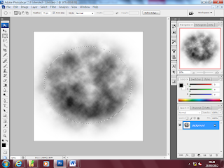 8. After this i created a new canvas and used the circular marquee tool with a feather effect of 75 px and then created a circle on the canvas and went to filter then clicked on render and then on the cloud effect . Then i selected the whole image and went to edit and pressed define brush set.
 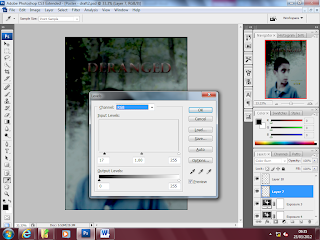 9. Then changed the opacity of the image so that the brush effect blended in with the dark background. Then i adjusted the levels of the image again so that it looks professional.
 8. After this i created a new canvas and used the circular marquee tool with a feather effect of 75 px and then created a circle on the canvas and went to filter then clicked on render and then on the cloud effect . Then i selected the whole image and went to edit and pressed define brush set.
  9. Then changed the opacity of the image so that the brush effect blended in with the dark background. Then i adjusted the levels of the image again so that it looks professional.
 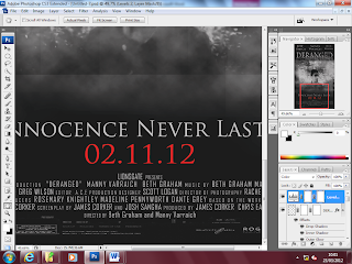 After this i imported the credits that had been edited in fireworks to the poster and placed them at the bottom of the poster based on other posters we had research. i also used the font Trojan pro for the tag line and the date it comes out. This is a classic horror font and clearly represents the genre. A then used the same font for the deranged title as i used in the trailer to ensure consistency. This is how i used phototshop to create the poster. The only improvements i could have made to this i think is to change the date so that it matches with date on the trailer and i think the mist could have been blended in a bit more to the background. But there has been a significant improvement since the first draft we made and our skills with photoshop have also become better as a result.
 Thursday, 22 March 2012
Evaluation: Plan
We have now moved into the evaluation stage of the whole production, this is where we have to answer 4 questions about the production of the trailer explaining what we could have improved and if it is an effective product overall. The questions we have to answer are as follows:
- In what ways does your media product use, develop or challenge forms and conventions of real media products?
- How effective is the combination of your main product and ancillary texts?
- What have you learnt from your audience feedback?
How did you use media technologies in the construction and research, planning and evaluation stages? i am going to answer these questions over the next 2 weeks and upload them to my blog. by answering these questions we are also getting marked on :
- understanding of the forms and conventions used in the productions.
- understanding of the role and use of new media in various stages of the production.
- understanding of the combination of main product and ancillary texts.
- understanding of the significance of audience feedback.
- skill in choice of form in which to present the evaluation.
- ability to communicate.
- use of digital technology or ICT in the evaluation.
This is why as part of our evaluation we are going to do a presentation as well as have an interview with our media teacher about the products that we have produced as this will show our use of digital technology and ICT in the evaluation as well as our ability to communicate. We are also goingt o produce a documentary and a commentary about our products so we can explain how they were produced step by step. The plan for the following two weeks is as follows:
· 8th march - Interview ,
· 23 march - presentation showing and explaining the products that we have made.
· As part of our evaluation we are going to have a behind the scenes documentary,
· Video clips of audience feedback
· Blog entry with screen shots to show how we edited the print products
· Blog entry including screenshots, showing how the trailer was edited and put together
· Commentary to go with the trailer
· Explain why we chose the genre we did
· Explain what our mistakes were and how we could have improved
· Explain what our inspiration for the trailer was
· How our use of technology improved
· How product compares to product at AS , how have we progressed since AS
Tuesday, 6 March 2012
Comparison: Poster
Here is a poster i think looks quite similar to ours, mainly because of the colour scheme and the main image in the middle.
I am comparing these two ancillary products to see how much ours relates to proper professional posters. We have used the colour scheme as shown in the image below black white and red, The black is common in the horror genre to give a sense of a dark atmosphere and make it appear more spooky, this is clearly more appropriate and effective than brightly coloured backgrounds. The image on the last house on the left is fairly small but the white mist makes it look mysterious, this is the effect I've tried to create on our poster.
Although on the last house on the left poster some of the text is in red, i think on our poster we don't have as much red text this is to insinuate that there isn't going to be that much blood just because our film is a 15 and is aimed at a slightly younger audience. I think the simplicity of this poster is effective and it just makes it look like a darker film.
 I have adapted and developed the ancillary product by making the tag line at the bottom of the image considerably larger to create more of an impact on the audience. I have also made a shadow beneath the title deranged which i think fits into the horror genre, and creates more atmosphere. Also in ours we used the main character instead of setting because it links well to the trailer so that people can associate the poster and trailer. Whereas if it is a setting similar setting could be in other films, and the audience could possibly not distinguish the poster as being linked to a particular film.
I am comparing these two ancillary products to see how much ours relates to proper professional posters. We have used the colour scheme as shown in the image below black white and red, The black is common in the horror genre to give a sense of a dark atmosphere and make it appear more spooky, this is clearly more appropriate and effective than brightly coloured backgrounds. The image on the last house on the left is fairly small but the white mist makes it look mysterious, this is the effect I've tried to create on our poster.
Although on the last house on the left poster some of the text is in red, i think on our poster we don't have as much red text this is to insinuate that there isn't going to be that much blood just because our film is a 15 and is aimed at a slightly younger audience. I think the simplicity of this poster is effective and it just makes it look like a darker film.
 I have adapted and developed the ancillary product by making the tag line at the bottom of the image considerably larger to create more of an impact on the audience. I have also made a shadow beneath the title deranged which i think fits into the horror genre, and creates more atmosphere. Also in ours we used the main character instead of setting because it links well to the trailer so that people can associate the poster and trailer. Whereas if it is a setting similar setting could be in other films, and the audience could possibly not distinguish the poster as being linked to a particular film.
 Thursday, 1 March 2012
Magazine Image
This is our magazine with the image. i had to change the background to black which works ok i think, i thought i would have had to do that anyway to give more of a horror effect. I may try some further editing to the image today and tomorrow.
Subscribe to:
Comments (Atom)


